Sunday 7 April 2013

RESEARCH (Joshua Hoffine)

I started making photographs shortly after graduating from college with a degree in English Literature. My original portfolio of photographs was very dark and disturbing. At that time, I was interested in Frederick Sommer and Joel Peter Witkin, and was creating proto-horror assemblages that sometimes included animal parts. I landed an internship with Nick Vedros, who is the biggest photographer in my hometown of Kansas City, and Nick encouraged me to make my work more palatable to survive as a commercial photographer. From Nick I moved onto Hallmark Cards, which is also based in my hometown. 


The Horror genre is a vast sprawling landscape, populated by numerous sub-genres and hybridized genre mutants, like the Horror-Comedy, Sci-Fi Horror, and even the Horror Musical.  Some would argue that it is impossible to devise a definition of Horror that encapsulates them all.  What is the difference between a Horror film and a Thriller?  Or a Horror film and a Suspense film?

 I was very inspired by him, when I was creating my project "Who am I, Where am I?", cause my project is about child's fears too. But the difference is that I don't want to show pure naked fear with all that horror stuff, I want it to be more natural, but still a bit scary for child.


Situations, I depict came up from my own memories and fears, as well as the fears of my children. There are sometimes allusions to specific horror films or fairy tales. I am especially attracted to any fears that might be considered universal - like the fear of a monster or boogeyman lurking under your bed.


 Does a movie require a monster, or a supernatural element to qualify as Horror? Dictionary.com defines Horror as “an overwhelming and painful feeling caused by something frightfully shocking, terrifying, or revolting.” The Horror genre seeks to elicit this negative emotional reaction from viewers.  Stock elements, such as ghosts, vampires, serial killers, and so forth, may populate the Horror genre, but they do not define it. Movies about the supernatural, and movies with monsters, are not necessarily always horrific.  I believe that the Horror genre is best defined by it’s intent to terrorize the audience. Although many sequences in non-Horror films are frightening, they do so to advance narrative agendas that have something other than fear at their cores.  Non-Horror films may frighten the audience to tell their stories, but Horror films tell stories to frighten the audience.  In the former, fear is a side effect; in the latter, it is the object of the exercise.

Tuesday 26 March 2013

RESEARCH (Bill Viola).


Bill Viola is a contemporary video artist. He is considered a leading figure in the generation of artists whose artistic expression depends upon electronic, sound, and image technology in New Media. His works focus on the ideas behind fundamental human experiences such as birth, death and aspects of consciousness. His art deals largely with the central themes of human consciousness and experience - birth, death, love, emotion and a kind of humanist spirituality. Throughout his career he has drawn meaning and inspiration from his deep interest in mystical traditions, especially Zen Buddhism, Christian mysticism and Islamic Sufism, often evident in the transcendental quality of some of his works. Equally, the subject matter and manner of western medieval and renaissance devotional art have informed his aesthetic.

 An ongoing theme that he constantly explores is dualism, the idea that you can't understand what you're looking at unless you know its opposite. For example, a lot of his work has themes such as life and death, light
and dark, stressed and calm, loud and quiet.
Viola's work often exhibits a painterly quality, his use of ultra-slow motion video encouraging the viewer to sink into to the image and connect deeply to the meanings contained within it. This quality makes his work perhaps unusually accessible within a contemporary art context. As a consequence, his work often receives mixed reviews from critics, some of whom have noted a tendency toward grandiosity and obviousness in some of his work. Yet it is this very ambitiousness, his striving toward meaning, and attempts to deal with the big themes of human life, that also make his work so clearly appreciated by other critics, his audiences and collectors.
 While many video artists have been quick to adopt new technologies to their medium, Viola relies little on computer editing. Perhaps the most technically challenging part of his work—and that which has benefited most from the advances since his earliest pieces—is his use of extreme slow motion.
Bill Viola Studio is run by his wife, Kira Perov, who is the executive director. She has worked with Viola since 1978 managing and assisting Viola with his videotapes and installations. She documents their work in progress on location. All of the production done at the studio is edited by Perov.
 Viola felt as if there are 3 different structures to describe patterns of data structures. There is the branching structure, matrix structure, and schizo structure.


"The most common structure is called branching. In this structure, the viewer proceeds from the top to bottom in time."

 The second structure is the Matrix structure. This structure describes media when it follows nonlinear progression through information. The viewer could enter at any point, move in any direction, at any speed, pop in and out at any place. The last structure is called the schizo, or the spaghetti model. This form of data structure pertains to pure or mostly randomness. "Everything is irrelevant and significant at the same time. Viewers may become lost in this structure and never find their way out."

Moscow Museum of Modern Art.


The museum consist of different rooms with different meanings and  themes. So, the first room is made like old museum place. People just put some funny and extraordinary things, they have found somewhere, into glass cases and show their collection of these things to everybody. And I loved that sculpture of man, because he is awesome!!! And the thing with holes... I don't really know what is it, but I find the pattern very interesting and also I like the color of it. 


 These pictures and some articles were hanged on the wall. I liked the way artist experimented with forms and develop it to something new.
The work above is very big and made of big solid iron plates, which has geometric holes and text, written on it. I really liked the texture of it and it's a shame that u can't touch it! Well, next to this one is a big piece of canvas and there r lots of letters, but the words r the same and repeated hundred times. "I don't need anything", this is the sentence.

The work above is my favorite one! When I saw it, I was close to hug it!!! Cause I love stitching and sewing. It is very big and u can't see the blue big face if u r standing too close. The contrast between negative and positive space, between blue-red threads and white background chords to the plot, where artist juxtapose smile and despondency. Well, I really like it and hope that once I will make something like that!

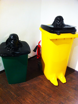
The heads sticking out of the garbage were very funny, cause instead of rubbish u expect to see human body inside. Also, on the yellow one below r legs)))

The painting was very colorful that is why I liked it. Sometimes it's hard to find something really interesting and colorful in contemporary art. It is so simple and so awesome: brush is lying, paints r there, palette knife is on his place and... That is awesome! I don't really know y I like it so much, but I do.

Wednesday 6 March 2013

Jewish museum.

“The history of Jews in each epoch reflects its spirit and peculiarities”, says the founder of the museum Alexander Moiseyevich Boroda. This is the cornerstone of the entire exposition. It is chronologically structured dwelling upon key points in history.
 “The Beginning” cinema theatre. The first thing catching our visitor’s eye is theround-shaped cinema hall. Here you can watch 4D films about the first days of the world – from its creation and the appearance of major religions to the destruction of the Second Temple and the establishment of the Jewish diaspora. 
That troubled time was the time of hope for Jews. The letter from the British Foreign Secretary Lord Balfour, also known as the Balfour Declaration, gave hope to believe there would soon be a Jewish national state in Palestine. The background for this were the Bolshevik Revolution and the ensuing Russian Civil War.
 Despite all the difficulties following the formation of present-day Russia, this period has turned out to be a favorable one for Russia’s Jews. We have finally gained freedom of religion and movement and respect from Russia’s officials.

A big interactive table shows the history of Jews’ migration. You may and should touch this exhibit. By tapping on certain parts of the map you will learn about the life of Jewish communities in different countries.


The interior of the hall dedicated to the Soviet Union bears a lot of symbolism. In the center of the ceiling you will see a five-pointed red star under which there are big screens showing images of different processes symbolizing that turbulent time – Collectivization, Electrification, Industrialization and other government initiatives that moved traditional Jewish issues to the background.

Translated from Yiddish, shtetl means a small settlement or a town. Shtetls were places in the Russian Empire with a large number of Jews among their population after the adoption of a law banning Jews from settling in big cities also known as the Pale of Settlement. This part of the exposition reproduces a typical shtetl with squat houses, an invariable market, a synagogue and a school. Two over three-meter tall glass panels show unique images of the life of Jews at that time. 


 This place of mourning was constructed in likeness to the Children’s Memorial in Yad Vashem, the National Holocaust Museum in Israel. The building, made of old aviation steel, has a multitude of mirrors installed inside in such a way that the light of several candles, which are installed there as well is, is reflected a countless number of times. Heroism, betrayal, courage, defeat and victory are all parts of the rich history of the Second World War. On the huge dioramic screens you will see eyewitness accounts, people at the front, guerilla fighters, people in ghettos and in concentration camps – the pain and dreadful experience of the War. All museums are similar to some extent. Often it is a collection of items united by one theme, lying on display behind the glass. You cannot say the same about our museum. It is different. It is interactive. It is difficult to say what it resembles most, a museum in its conventional meaning or a theme park. The exposition imparts the information in a multitude of ways. It is multifaceted. It engulfs you, enters your mind and interacts with almost every single of your sense organs. And it is possible thanks to the cutting-edge audio-visual and computer technologies.

Reflection (From camera to infinity).


 Well, I've bought canvas 70x60, priming and oil. After layering priming I started to make an abstraction picture. I wanted it to be background at first, so I din't want there much forms or very bright colors. About colors: I wanted to show the atmosphere of this film by colors and messy forms. 

This is what was at the end.


Than I started to experiment. Well, I took sunflowers, shoe, big mustaches, which I've made by myself. I took a piece of sheep fur from my old coat and cut it.

 Also, I took paste for modeling and made a big gold tooth, cause in that film there were lots of people, who had "golden smile".  Furthermore, I visited my grand grandmother, who has some curtains and fabrics in that old style. So, all textile things are her. 


I experimented with textures, fabrics, old stuff and then decided to try change background a bit. I took a picture of Grga Pitić, who is smoking a cigar and watching a film in his big strange bed-chair. This is one of the most recognizable moments in the film, that is why I selected it. 


After all tryings I understood that I don't like it, that is why I made a messy rubbish on the canvas, finally. Here are some photos of it. But it was awful too... 


Finally, I decided to take just an abstract picture and photos, because sometimes simplicity is the most suitable one. But it was too simple and James gave me an advise to add more pictures. 

The problem was that I don't have money.